
So we made a game for Robyn and Red Bull Music. This is the third post in a series of posts about this. Here our Designer Viktor talks about adding artwork to the app.
Post nr 1: Making the server side…
Post nr 2: The making of …
Post nr 3: This post…
Step 1: Interpretation of a Mood Board
So, first things first, we did not have much to go on when the design process started. Or let me rephrase that, we had A LOT to go on, but it was a 30 page long mood board for the stage design of Robyns tour, which was also put together by a whole range of different people. I took some parts of it (the left half of the image below, which turned out to be the wrong half) that felt like they would merge together quite well and got to work on creating a look that could support the simple UI elements and the overall secretive feeling we wanted the app to convey.
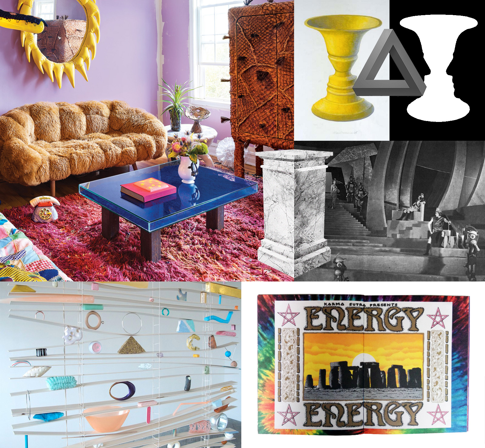
(not the actual moodboard)
Step 2: Designing the first look of the app
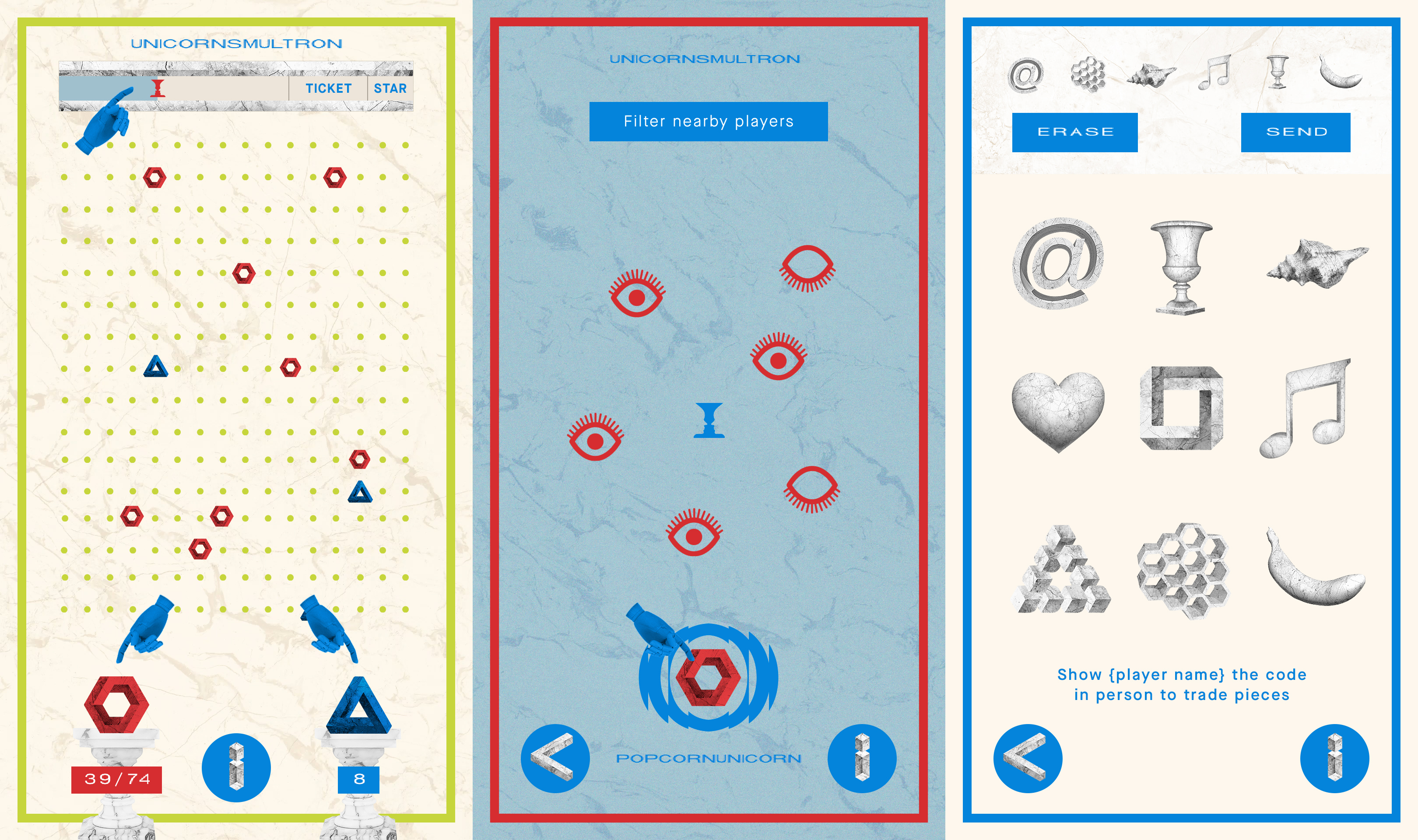
This is the first game board version, this is just a personal process but I like the idea of making the first draft of something as much as it can be and then scale down/remove stuff rather than the opposite way of adding stuff as you go along. The trade board was originally supposed to act like a radar so you could turn your phone and easily find people to swap with. Turns out (golfclap) almost no phones have the ability to do this in a good way, their favorite thing in the world is to to mindlessly spin around and point out west as north and so on. In retrospect this would neither have been needed since the players where awesome at organizing swap-meets!
A very early version of the achievement tab, it is always folded down over the current view so I wanted to experiment with a cut-out effect since video would be playing in the background.
Step 3: Design technology
I don’t know if this a broadly used terminology but in my experience it’s well worth spending a couple of hours on. Let me explain: one big challenge in this project was that we needed to test a lot of technical stuff as well as performance at the same time. What this means is that we had to have graphics from the get go that would change as little as possible. ‘Change as little as possible’ meant that we decided to render the app in 3 layers (simplified) one big animated background, one layer for ui elements, such as buttons, positions, well almost everything and last but not least, achievements as the third layer.
We also decided that we would use transparent pngs for all elements except text and backgrounds (video and or animated gifs) and that the transparent bounding boxes of the pngs would act as margins for layout purposes. This enabled us to update the entire look of the app without rewriting code each time. I set up all the assets as linked PSDs and arranged them in a couple of master files, one for each view in the app. So when feedback arrived I did not even had to work in any of the master files, I could update each asset on an individual basis and only really open master files for when the overall design was to be reviewed. I could also just replace files and they would almost automatically arrive in the app and update the whole look.
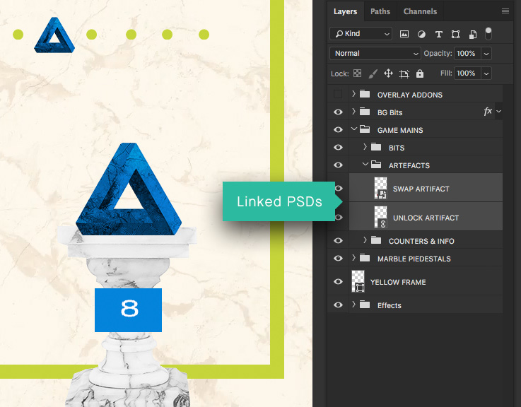
This might sound as small details but it enabled me to detach myself from developer deadlines and it made sure that the developers would not have to fear design feedback or changes, and we knew that we would have to make a lot of versions of the graphics since Robyn was working on artwork for both the first single, the album and the set design at the same time as we where building the app. All in all it made design a less stressful experience for all of us involved.
Step 4: Updated moodboard from Robyn
Robyns team got closer and closer to finished album artwork and the stage design so we finally had something to align the app against. So the first step was to tone down the crazy colors and achieve a more subtle feeling.
First draft of the game board was too much full on Miami 80s and the achievement notification REALLY went full on 80s! The third view of the game board is where we locked almost all elements and more or less only played with the colors up to the final version.
Step 5: Final colors for the album and a custom made Font
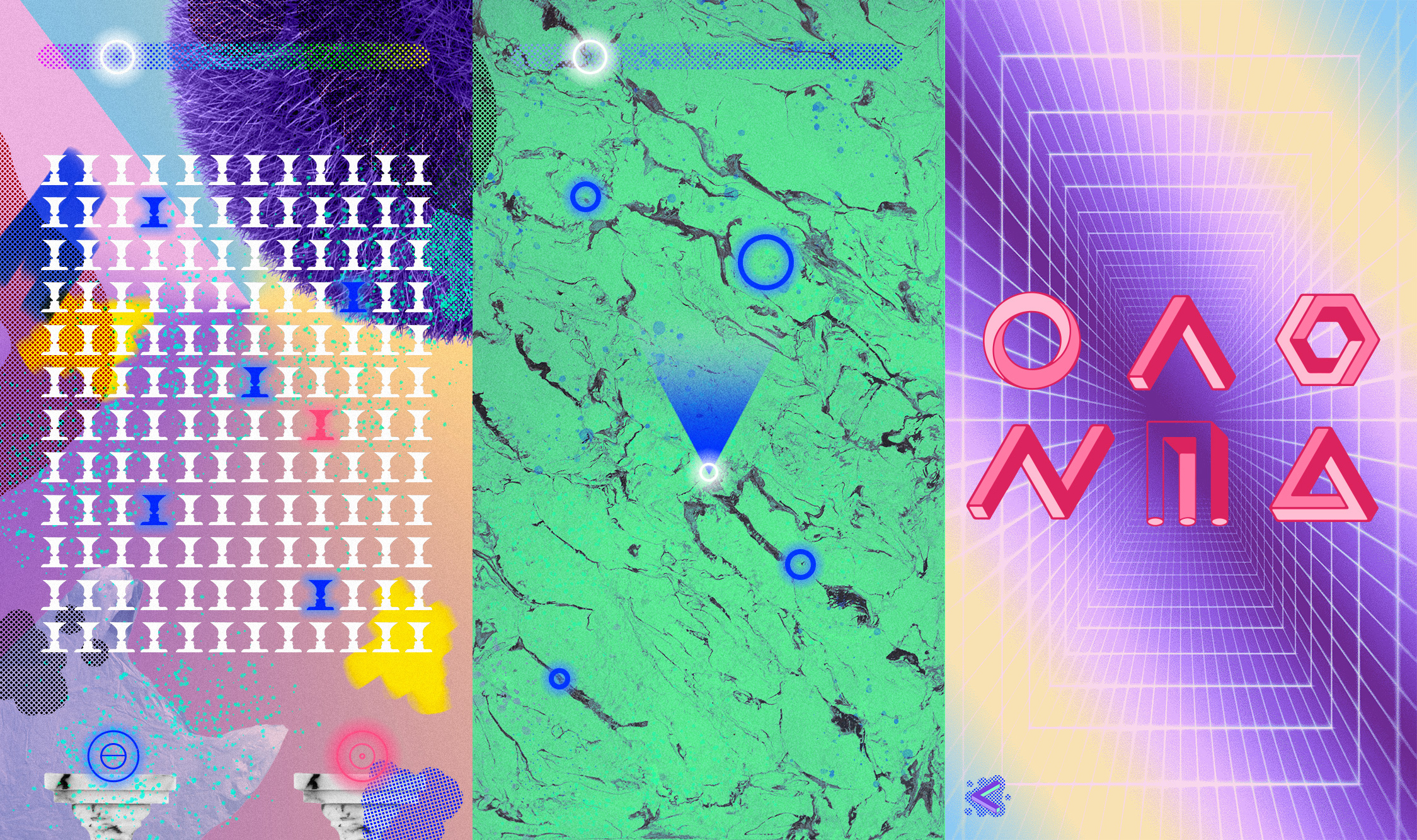
We got the final color scheme in the form of 5, 2 part color combinations and I thought: “wow those are some bold color combinations for an app, let’s do this, 100% throttle” and the result was, well let’s say it looked bold…
Game board & Achievements in extreme colors.
Step 6: The symbols
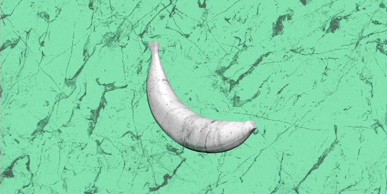
The symbols had a rather organic evolution, they started out in an asian calligraphy world, loosely tied to the name of Robyns label, Konichiwa, they however never felt right. They then went into something best described as computer OS icons, then to retro game, then to impossible stone shapes. When they where shown to Robyn she came up with a list of artifacts she felt would represent her and the album. In that moment they also changed name from pieces to artifacts. So in order of birth, here they are:
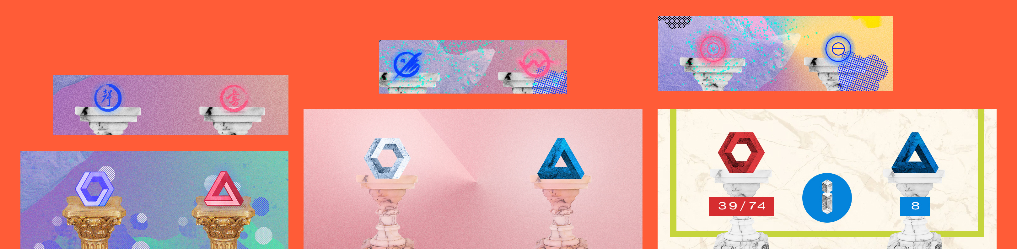
Evolution of the trade & unlock symbols.
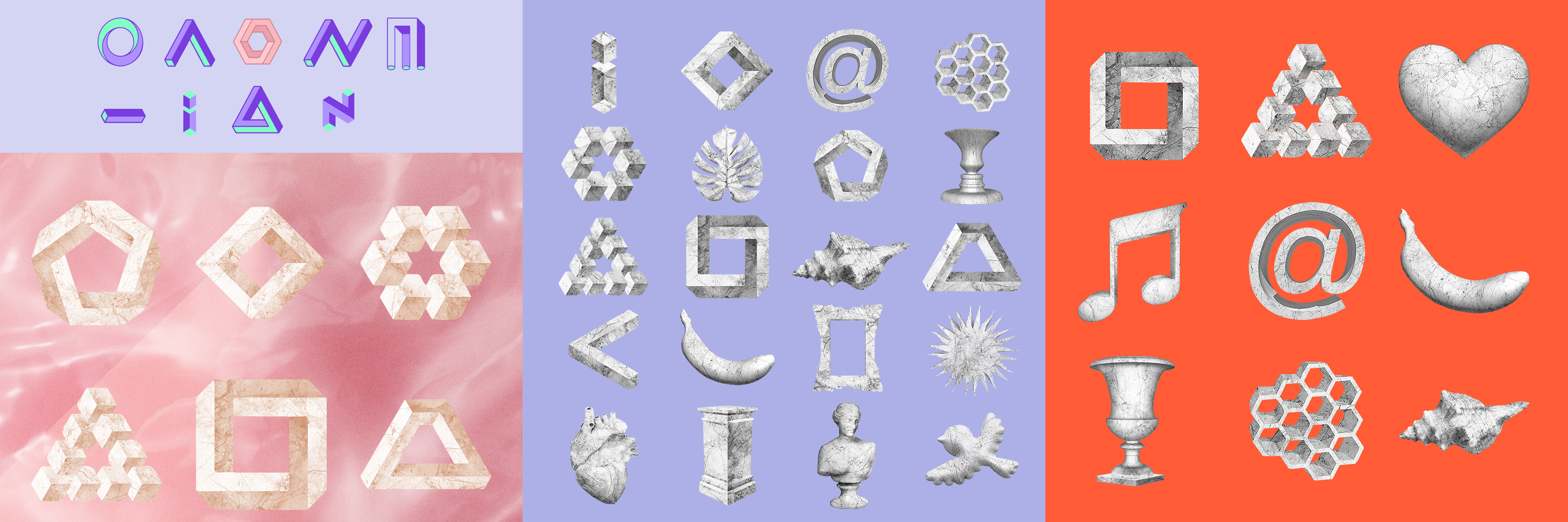
First selection of artifacts to the final codes!
Step 7: Killing your darlings because of performance 🙁
Initially each and every single view of the app was supposed to have an animated background. We wanted to have this because the UI itself has little or no animation or visual feedback (you click a button on the home screen and go to another screen) and it would be the most effective way to bring the app to life and give it a sense of flow and dynamic. We hung on to the idea a long time but in the end it was too much of a risk performance wise to have anything interfere with the swap view. If the experience of swapping was slow the whole core and integrity of the app would be in jeopardy and we really, really wanted people to share artifacts with each other!
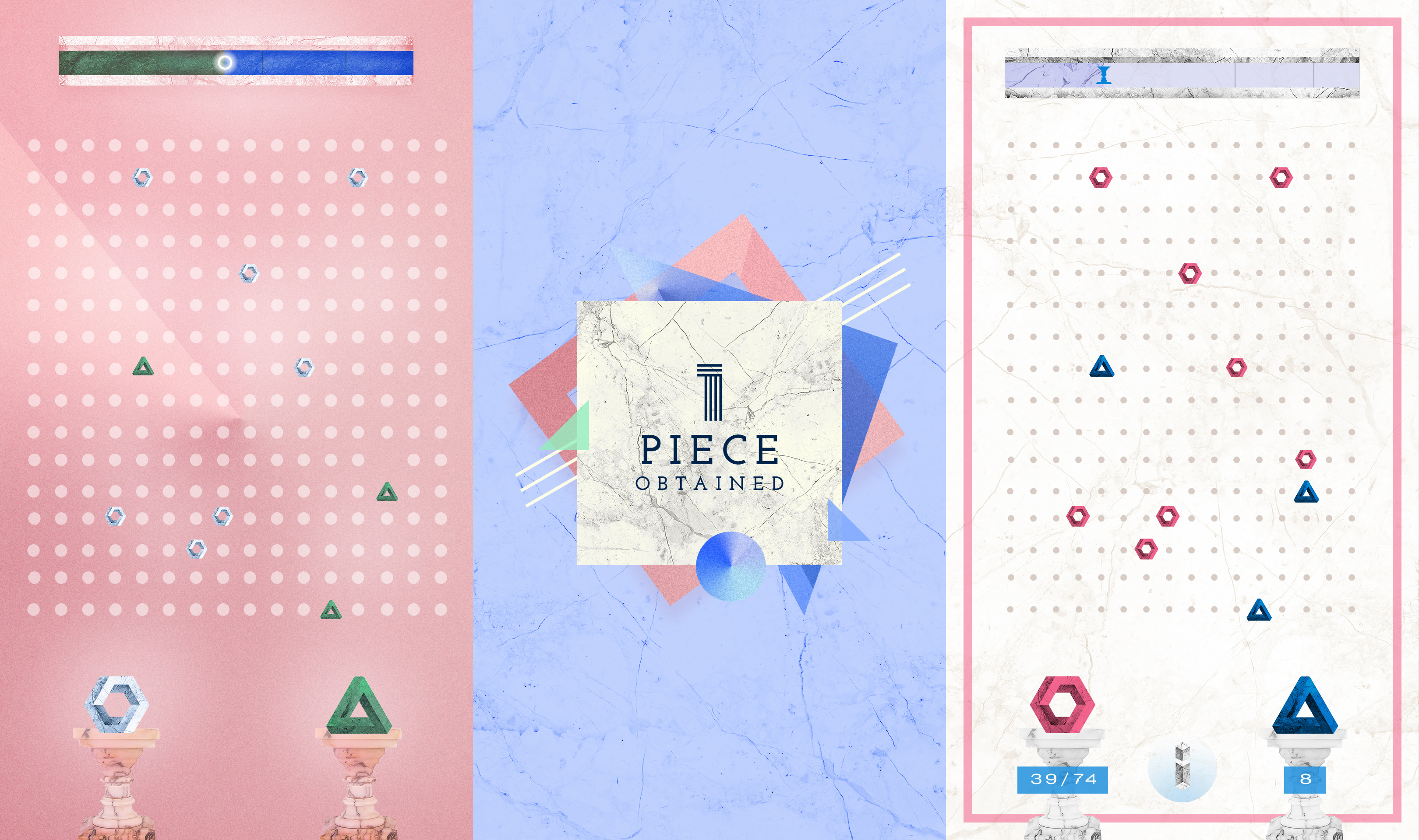
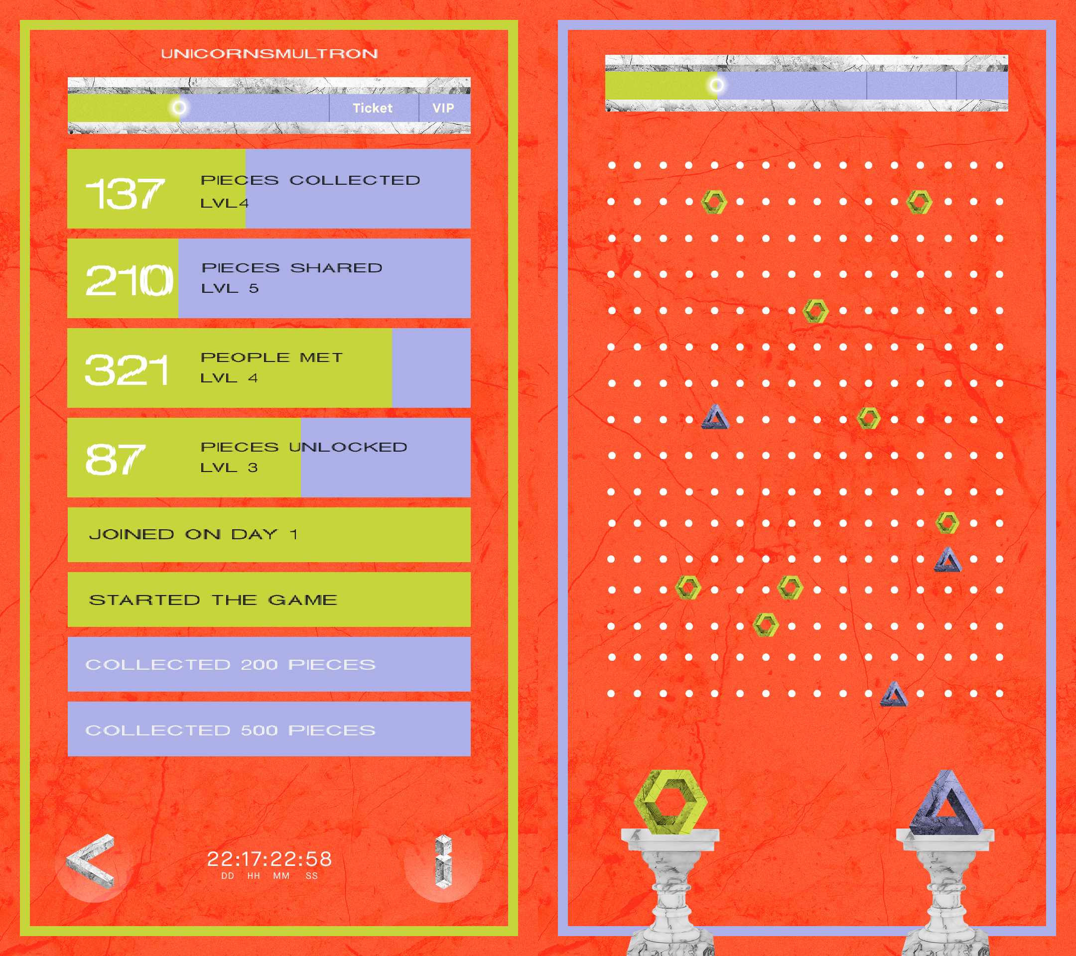
Step 8: The final product!
Step 9: Be really happy that you got to be a part of this!
Thank you Red Bull and Robyn for making this really fun and rewarding, I’ll repeat what the previous post about this project concluded: If you ever get the chance to make something for Robyn’s fans, take it.