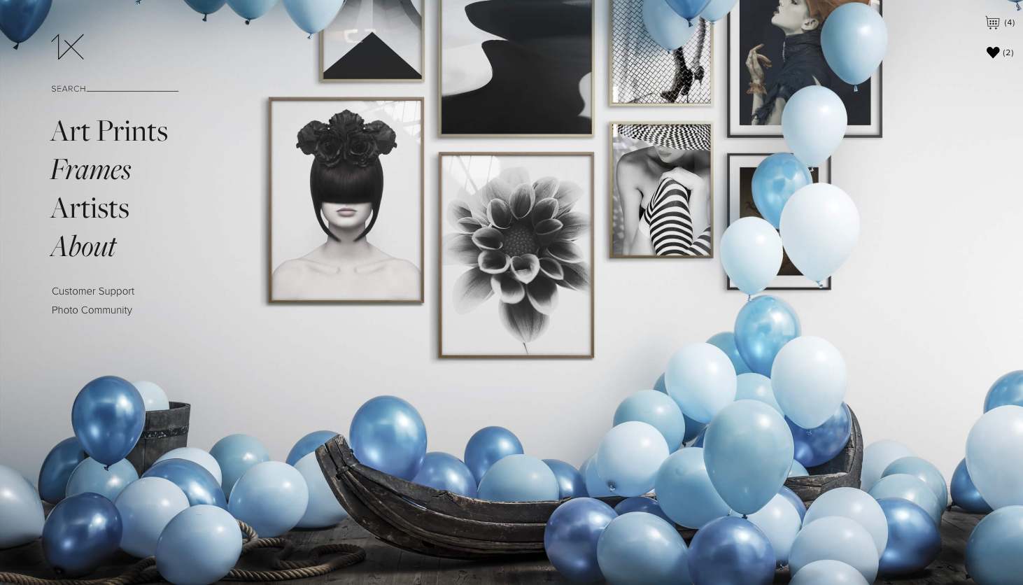
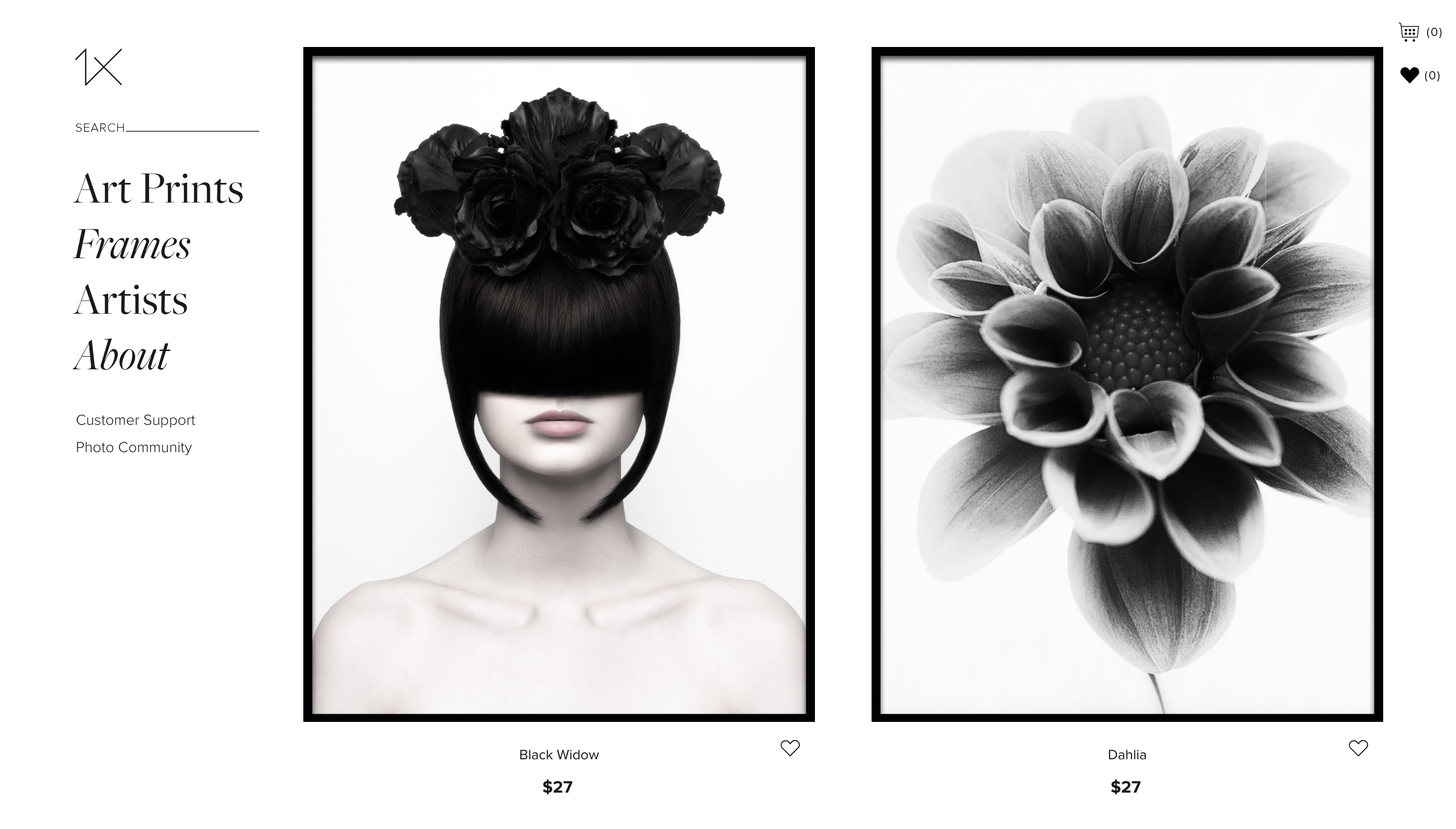
1x, the high-end photo community, wanted to broaden their business proposal and start selling art prints by its members directly to the consumer market. Earth People was hired to design and build the frontend for their brand new web shop in close co-operation with 1x who builds and maintains the backend across the community and the web shop.
From the get-go we set a couple of guiding principles in liaison with 1x:
- Premium is what the look and feel should convey.
- Large photographs are the focus of attention.
- Be flamboyant and over the top, not average and common.
- Show, don’t tell. A picture is worth a thousand words
- Drunkenly easy to use, but not your usual user experience.
So how did we achieve this?
The photos are indeed of pristine quality over the board. No problem to blow them up in scale. The challenge is that they come in all styles and colours. So the the sensible thing to do was to go for a clean black over white design. This way the UI will never clash with the images. But how do we keep the website from being too minimal (and, god forbid, boring)? We went for large typography and a, somewhat unusual, pairing of regular and italic serif typefaces. This was combined with a discreet, smallish sans-serif for all function copy to exaggerate the contrast between big and small. And to to glue all of this together we had large hero images and photo walls in eccentric settings. No beige IKEA furniture to be found.
How do you get to be unusual, yet dumbingly easy to use? We looked at plenty of other web shops, and what became obvious was that most of them uses one or another of the global plug and play web shop solutions. But that wasn’t sufficient to meet our standards. We wanted to keep the cart and the check out process in the same modal, with the flexibility to go back and forth in the process without any hassle, and also utilise various auto-complete techniques. So we built our own cart and check-out solution to keep the user experience as lean as ever possible.
We also thought a lot about mobile devices and how to make the laziest couch potato reach the checkout button. 1x encouraged us to explore different possibilities on how to navigate the website in the palm of your hand. After trying out different ideas on how to open the menu through various touch gestures we scrapped that and ended up with an elegant and simple to use a thumb zone navigation consisting of a contextual action button, a combined search-menu button and favourites and cart buttons.